Mean is very popular in many statistics used for evaluating performance. But does one is really aware of all pitfalls that may come with analysing data only with mean in scope?
Can you trust the average response time? Transactions per second?
The following was generated using pandas and Jupyter Notebook. If you are unaware of these, I’d suggest you check them out at some stage. I will probably write a few sections/hints & tips throughout the series. For a start in pandas, you can check out this tutorial.
If you want to try this out yourself, you can download the data needed below.
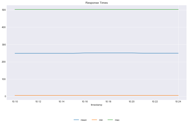
Plot the average/mean, max and min in 1 minute intervals
1 2 3 4 5 6 7 8 9 10 11 12 13
## Plot the average/mean, max and min in 1 minute intervals ax = rs.set_index('timestamp').resample('1min').mean()\ .rename(columns={'response_time': 'mean'}).plot() rs.set_index('timestamp').resample('1min').min()\ .rename(columns={'response_time': 'min'}).plot(ax=ax) rs.set_index('timestamp').resample('1min').max()\ .rename(columns={'response_time': 'max'}).plot(ax=ax) ## move legend to bottom ax.legend(loc='lower center', bbox_to_anchor=(0.5, -0.25), ncol=4) ## set title ax.set_title('Response Times') ## Turn on grid ax.grid()
What does this tell us about the customers response times?
Answer: Not a lot.
We can say that the minimum response time is around 5ms, the maximum is around 500ms. The average/mean is around 250ms however what does average/mean mean? Does this mean that the most of the customers received a response time of 250ms? Answer: We can’t say anything for sure.
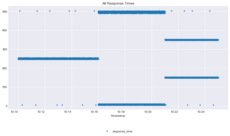
Let’s plot all the response times and see what we have.
1 2 3 4 5 6 7 8 9 10 11 12 13 14 15 16 17
ax1 = rs.plot(x='timestamp', y='response_time', style='.')
## Pretty up the graph a little
## move legend to bottom
ax1.legend(loc='lower center', bbox_to_anchor=(0.5, -0.25), ncol=3)
## set title
ax1.set_title('All Response Times')
## Turn on grid
ax1.grid()
## Fix XAxis legend
## set the major ticks range from 10:10 to 10:25 every 2 minutes
ax1.xaxis.set_major_locator(mdates.MinuteLocator(byminute=range(10, 25, 2)))
## format the time
ax1.xaxis.set_major_formatter(mdates.DateFormatter('%H:%M'))
## rotate the text
for label in ax1.get_xticklabels():
    label.set_rotation(0)
That’s a pretty different view from the previous graph
It looks like 3 very different profiles were run. But we didn’t see this in the Mean/Min/Max Graph.
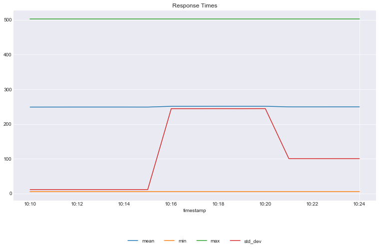
What can we add to the previous graph to the previous graph to give us a better view of the profile of the response times?
## Plot the average/mean, max and min in 1 minute intervals
ax = rs.set_index('timestamp').resample('1min').mean()\
.rename(columns={'response_time': 'mean'}).plot()
rs.set_index('timestamp').resample('1min').min()\
.rename(columns={'response_time': 'min'}).plot(ax=ax)
rs.set_index('timestamp').resample('1min').max()\
.rename(columns={'response_time': 'max'}).plot(ax=ax)
rs.set_index('timestamp').resample('1min').std()\
.rename(columns={'response_time': 'std_dev'}).plot(ax=ax)
## move legend to bottom
ax.legend(loc='lower center', bbox_to_anchor=(0.5, -0.25), ncol=4)
## set title
ax.set_title('Response Times')
## Turn on grid
ax.grid()
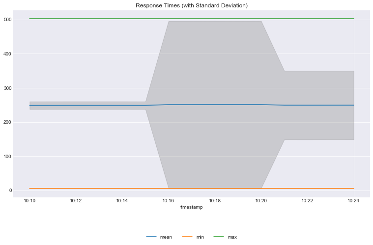
We can make it look even better and more intuitive
## store the mean
mean = rs.set_index('timestamp').resample('1min').mean()
std_dev = rs.set_index('timestamp').resample('1min').std()
## plot the mean in ax
ax = mean.rename(columns={'response_time':'mean'}).plot()
## plot min and max
rs.set_index('timestamp').resample('1min').min()\
.rename(columns={'response_time': 'min'}).plot(ax=ax)
rs.set_index('timestamp').resample('1min').max()\
.rename(columns={'response_time': 'max'}).plot(ax=ax)
## plot the range of std_dev
plt.fill_between(mean.index,
                mean.response_time - std_dev.response_time,
                mean.response_time + std_dev.response_time,
                color = 'grey',
                alpha = 0.3)
## Move legend to bottom
ax.legend(loc='lower center', bbox_to_anchor=(0.5, -0.25), ncol=4)
## Set title
ax.set_title("Response Times (with Standard Deviation)")
## Turn on grid
ax.grid()